Tucson JCC Annual Report

Overview & Challenge
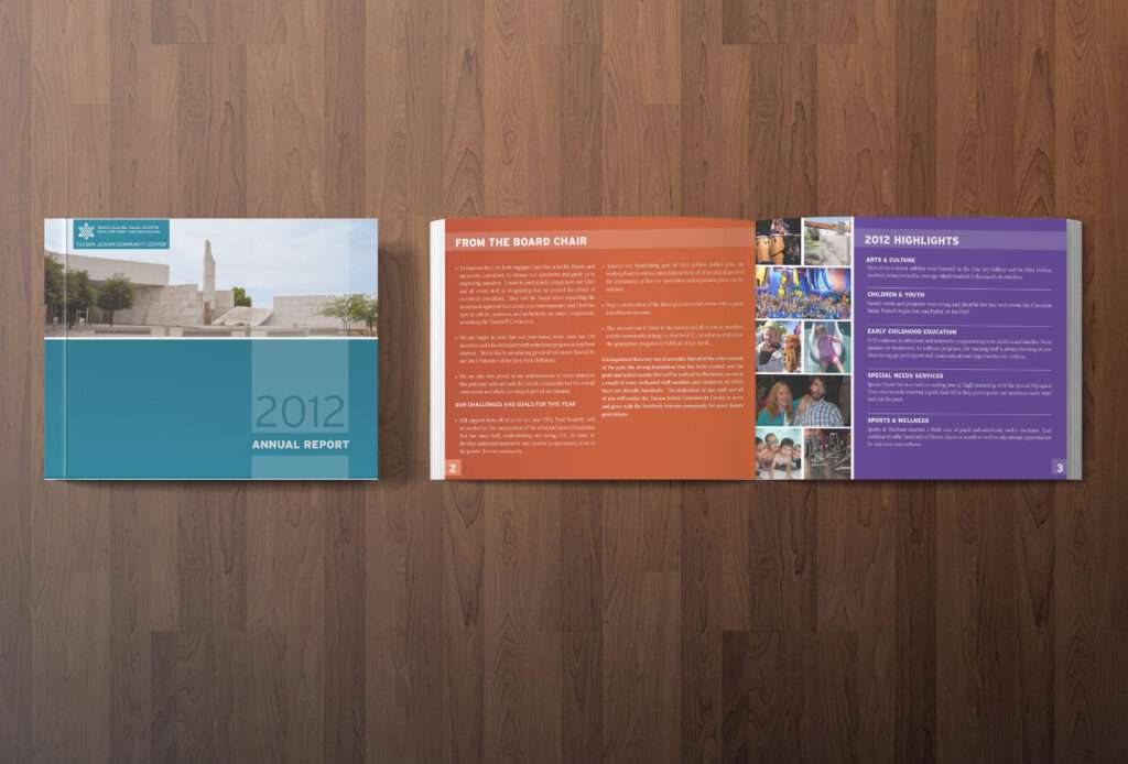
The Tucson JCC hired me to design their 2012 Annual Report, following their brand guidelines. They requested it be clean, modern, and easy to read. It was highly complemented compared to previous annual report.
One of the biggest challenges with working with this client was their national brand colors were incredibly intense, and tints were not allowed. While definitely energetic and fun, this tended to make their more corporate and serious work feel too casual and light-hearted.
Audience
Shareholders, investors, employees, and members.
Approach
Using the National JCC’s brand guidelines, this was first presented in a rough layout form, highlighting photos showing the vibrant energy and activities available at the JCC. Text was clear and concise, so I had lots of negative space to use, giving the pages individual color schemes, with white text.
